![](https://cdn.myportfolio.com/72f7ef8aca913a4517c0ecb665a98c88/772064e8-6372-4cdd-8521-04ffc54923de_rw_1920.png?h=8760c786f581153677e27307fb123edb)
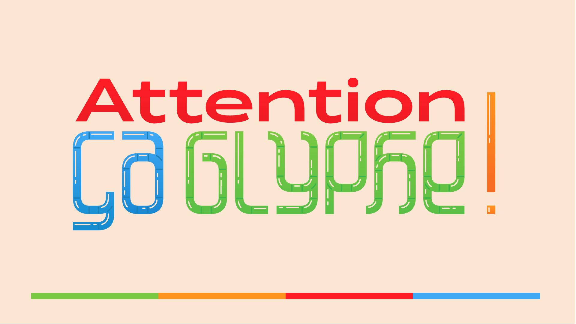
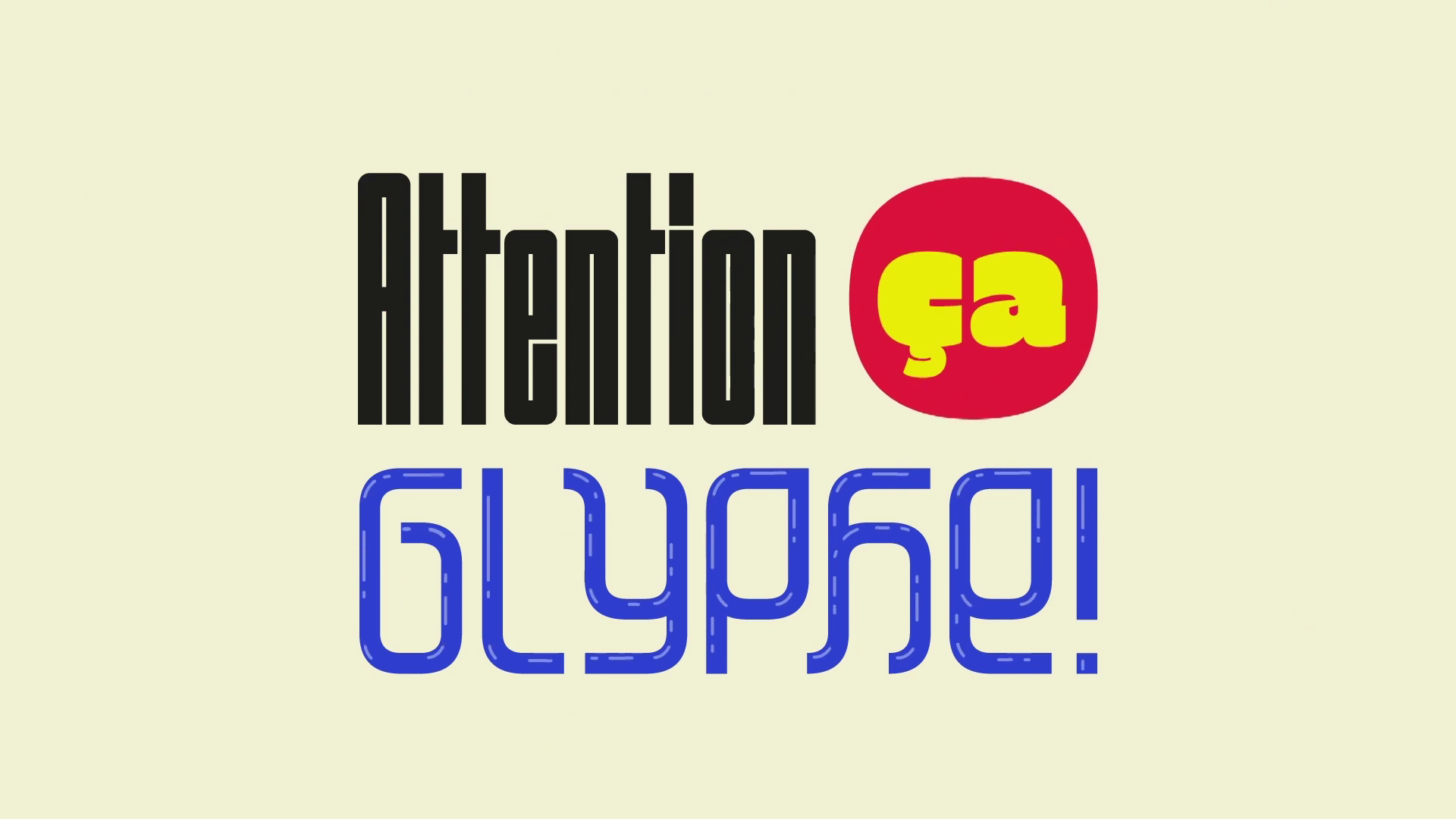
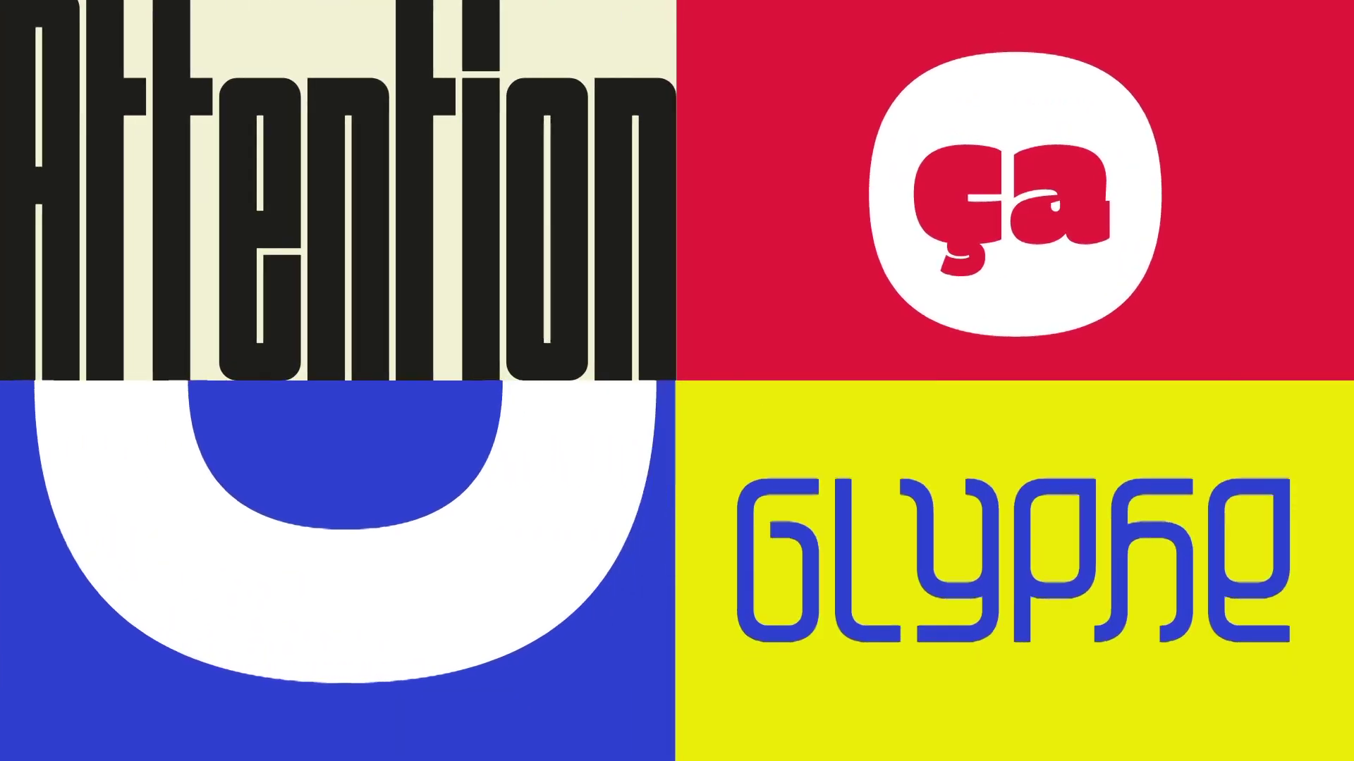
Lettering and art direction consulting for "Attention Ça Glyphe !"
a Youtube show about Typography and Graphic design.
Here are a few propositions I made, as well as the final branding
and implimentations by the show's creator, Manon Van der Borght.
a Youtube show about Typography and Graphic design.
Here are a few propositions I made, as well as the final branding
and implimentations by the show's creator, Manon Van der Borght.
![](https://cdn.myportfolio.com/72f7ef8aca913a4517c0ecb665a98c88/4b61c7d0-5590-43af-8b5f-4f4a4779bfe7_rw_1920.jpg?h=5fda1d6b3e35c2ab6169ba3d0aaff3e0)
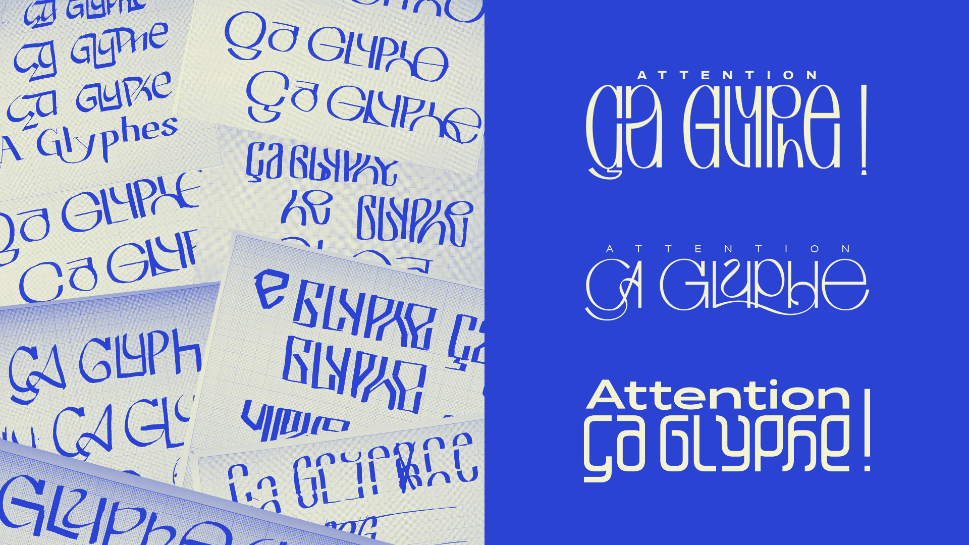
My quite messy first drafts and propositions for the main lettering.
![](https://cdn.myportfolio.com/72f7ef8aca913a4517c0ecb665a98c88/dda22dd5-c6f1-471c-a038-3cf774a44115_rw_1920.jpg?h=6ec7986ac1076047b7f3d0b62459072e)
![](https://cdn.myportfolio.com/72f7ef8aca913a4517c0ecb665a98c88/02596134-74b7-4313-9f4e-934c4da1d05b_rw_1920.jpg?h=77d0f9ec032f77e4155ac00f6b13bef0)
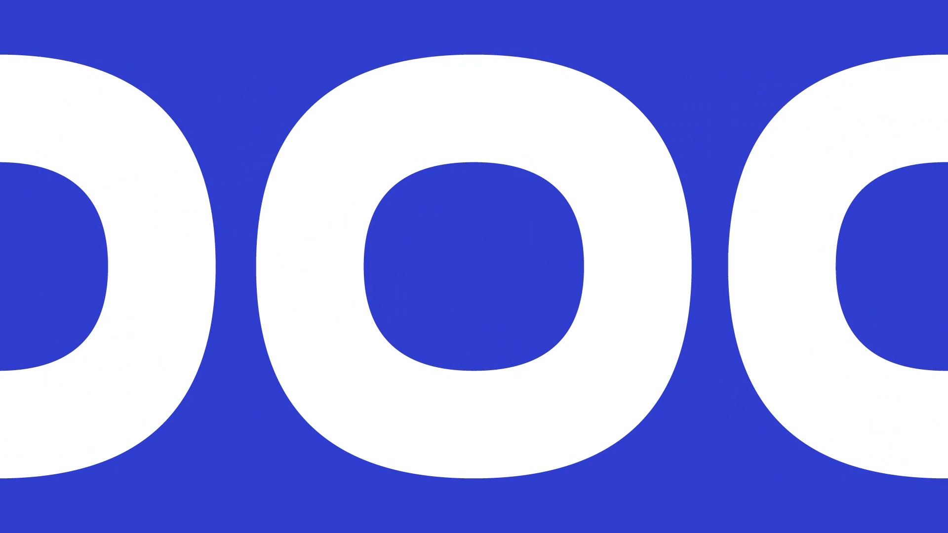
As the show focuses on explaining the intricacies of typography to a mainstream audience, my main proposal was to present the modular lettering
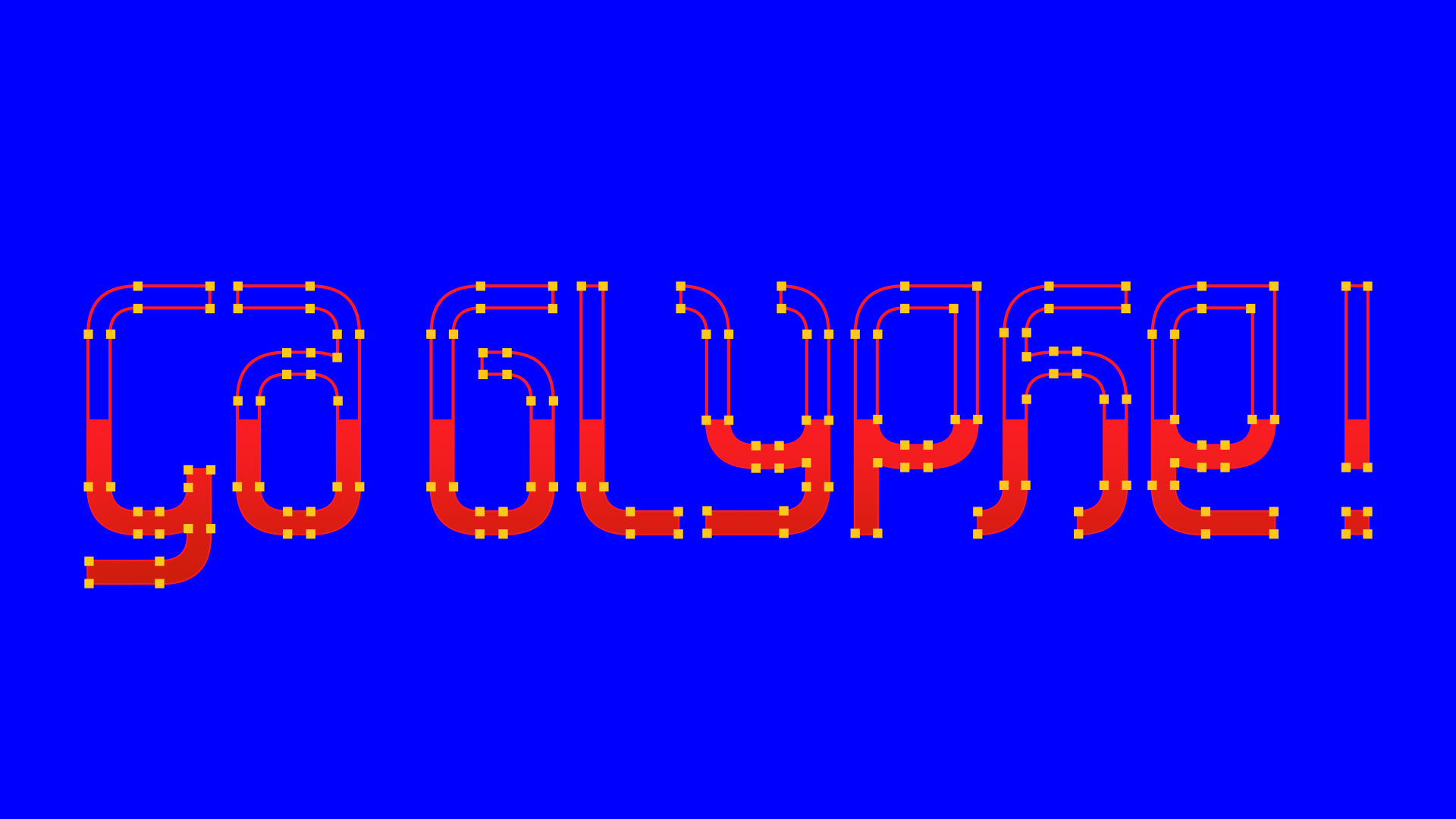
as a set of plastic tubes that anyone could assemble and play around with.
![](https://cdn.myportfolio.com/72f7ef8aca913a4517c0ecb665a98c88/e76ce333-e2fa-4896-903c-f2f1932212fd_rw_1920.png?h=d9bd6472e1b81c9cfe131e10ce76936c)
![](https://cdn.myportfolio.com/72f7ef8aca913a4517c0ecb665a98c88/a36b5f22-dcc8-459a-9cd8-125a31434829_rw_1920.png?h=ef3cc0ced0c777285fb83940e582abe2)
![](https://cdn.myportfolio.com/72f7ef8aca913a4517c0ecb665a98c88/a573af67-0c3d-4947-aca0-1c6212d3781b_rw_1920.png?h=4fd35aea4a5c58f5b43515b02391eeba)
![](https://cdn.myportfolio.com/72f7ef8aca913a4517c0ecb665a98c88/20a7c111-5f31-46f0-a1da-69b09eb1acc5_rw_1920.png?h=3779956ac00d0fab0f0b045a1d1d5e2a)
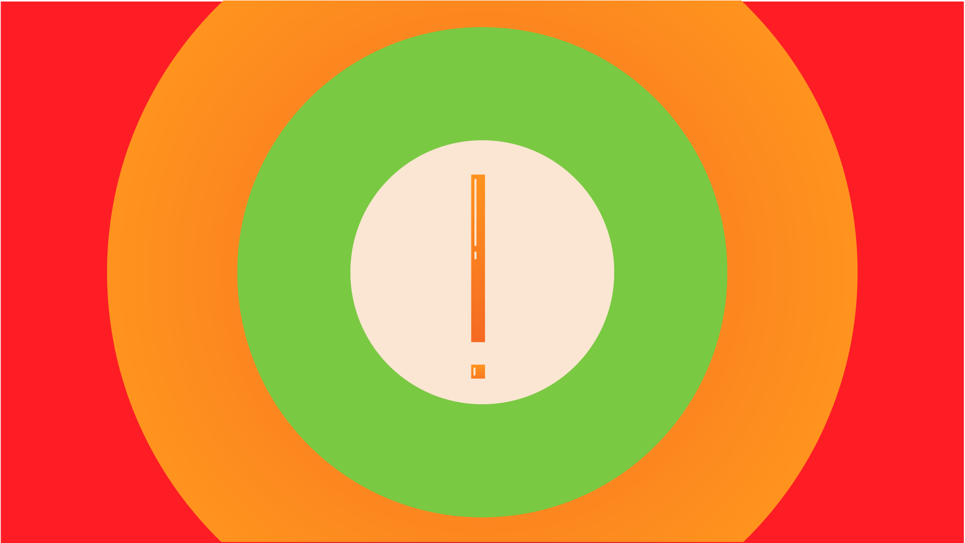
Above is my branding and opening sequence storyboard proposition.
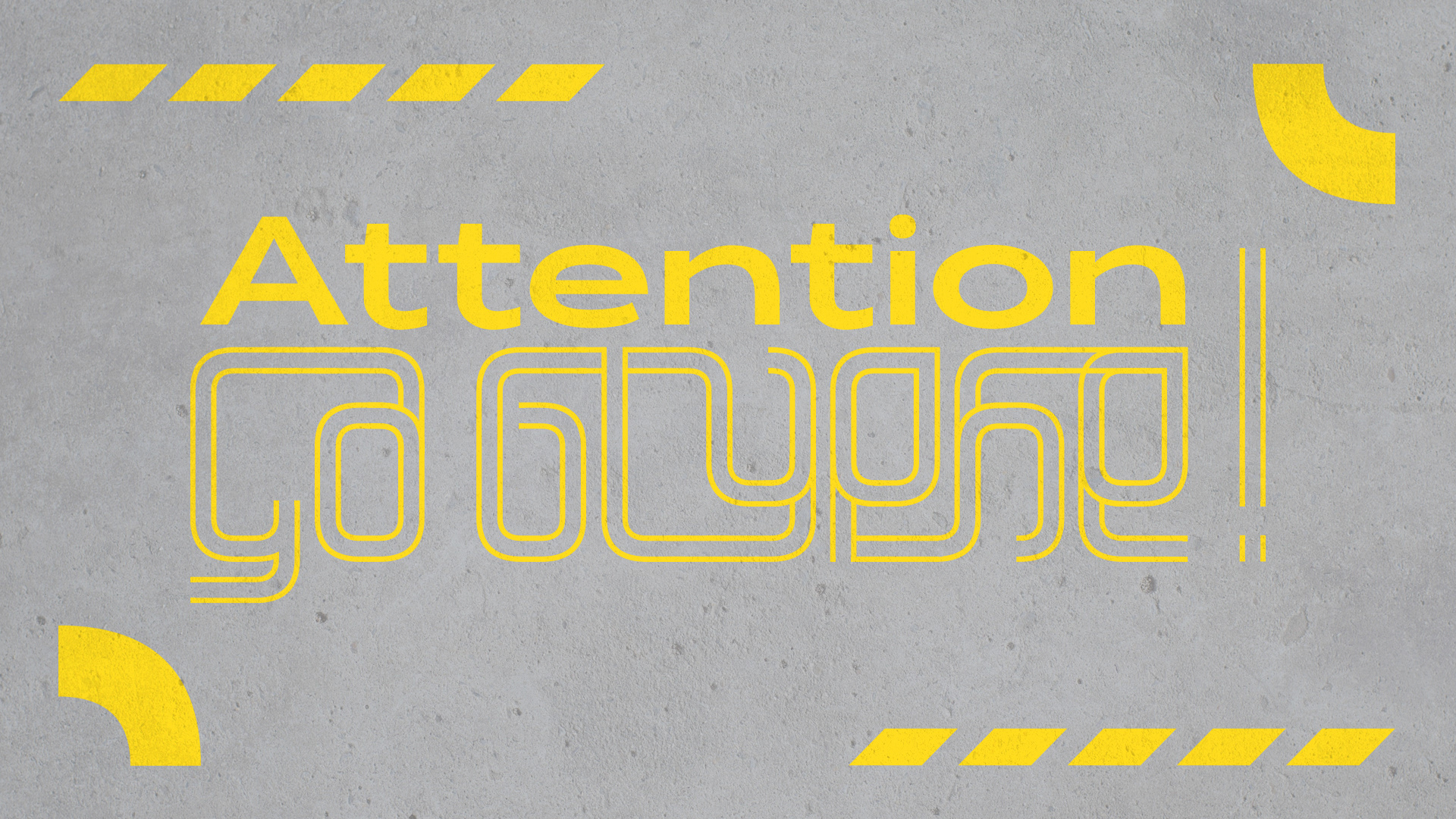
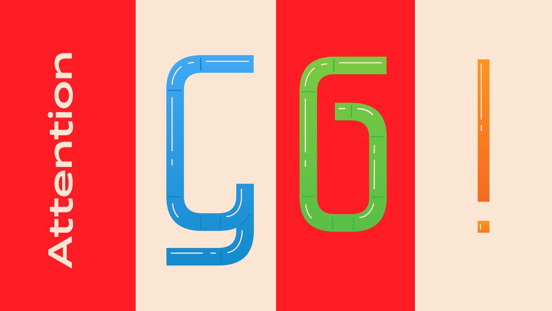
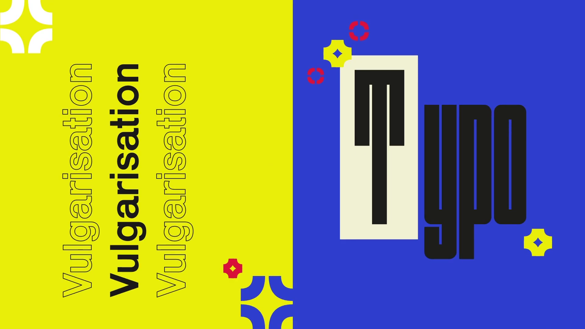
Here is the final branding and opening sequence designed and animated
by Manon Van der Borght. I proposed using parts of the modular lettering
as little animated elements to take advantage of its playfulness.
by Manon Van der Borght. I proposed using parts of the modular lettering
as little animated elements to take advantage of its playfulness.
![](https://cdn.myportfolio.com/72f7ef8aca913a4517c0ecb665a98c88/0796d300-4679-467e-bc6c-7abbcb7d2aa3_rw_1920.png?h=d4abf3a5356f95d6767793fad7414c6e)
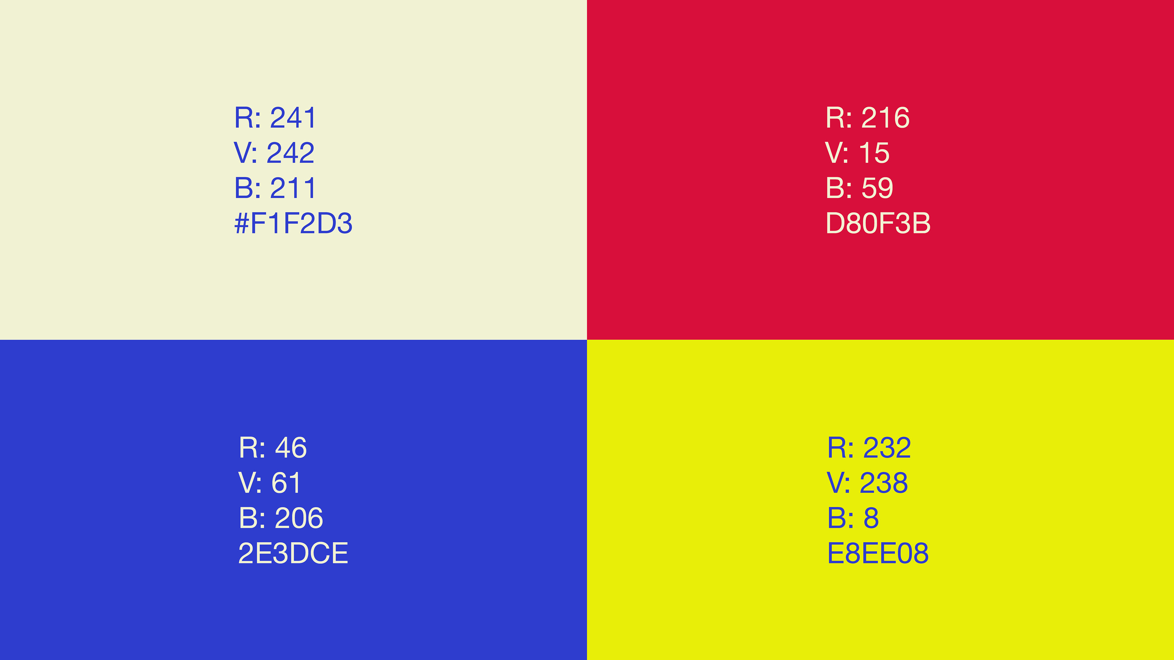
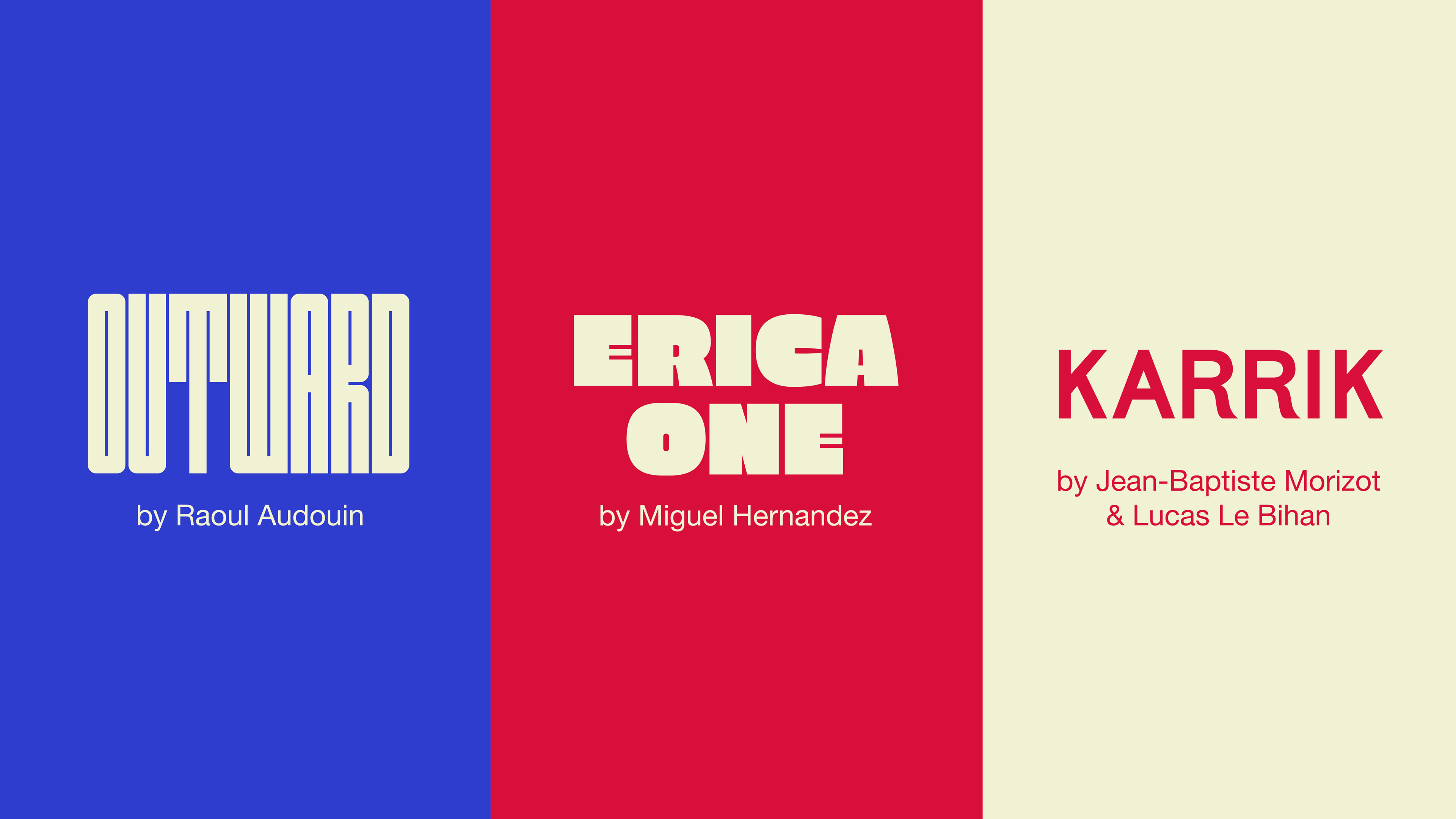
Underneath you'll find the final branding colors and fonts
picked by Manon Van der Borght.
![](https://cdn.myportfolio.com/72f7ef8aca913a4517c0ecb665a98c88/62a1b125-f6ea-4e71-ab4f-aba21a8e59e6_rw_3840.jpg?h=77a8ec28774ced6b3cc9a87b5a8f7b82)
![](https://cdn.myportfolio.com/72f7ef8aca913a4517c0ecb665a98c88/9f97195b-9c78-467c-ba5f-3a5a4398370a_rw_3840.jpg?h=3d63ccb1d07c6f94c0a19a33e9b3099e)
![](https://cdn.myportfolio.com/72f7ef8aca913a4517c0ecb665a98c88/9c1d4289-ae60-4378-b499-b6f4d1454e90_rw_1920.png?h=fb71a3985bb9b495274c9f62f93fe3c9)
![](https://cdn.myportfolio.com/72f7ef8aca913a4517c0ecb665a98c88/dff7205b-d1e4-421e-ada0-e92d34e7febf_rw_1920.png?h=4a35b4a0a57d1794469e31f6ad4fbcc7)
![](https://cdn.myportfolio.com/72f7ef8aca913a4517c0ecb665a98c88/33a7881c-4249-4e4d-ab00-8f09aa576508_rw_1920.png?h=c4de94ea55a5e7ec1bc2050855c90115)
![](https://cdn.myportfolio.com/72f7ef8aca913a4517c0ecb665a98c88/c062e85d-732f-4f17-991b-13079b9a2eff_rw_1920.png?h=302deca248ed2a34a744ade25833aa5e)
![](https://cdn.myportfolio.com/72f7ef8aca913a4517c0ecb665a98c88/1bc69c0d-e61f-4416-83ab-53b335ffc5d5_rw_1920.png?h=4911b029861f46d750ec2fc51d4c89f3)
![](https://cdn.myportfolio.com/72f7ef8aca913a4517c0ecb665a98c88/81816f83-921e-4ed9-8e24-69ba4e0f8d79_rw_1920.png?h=a112f106432704aab52476962a84f156)
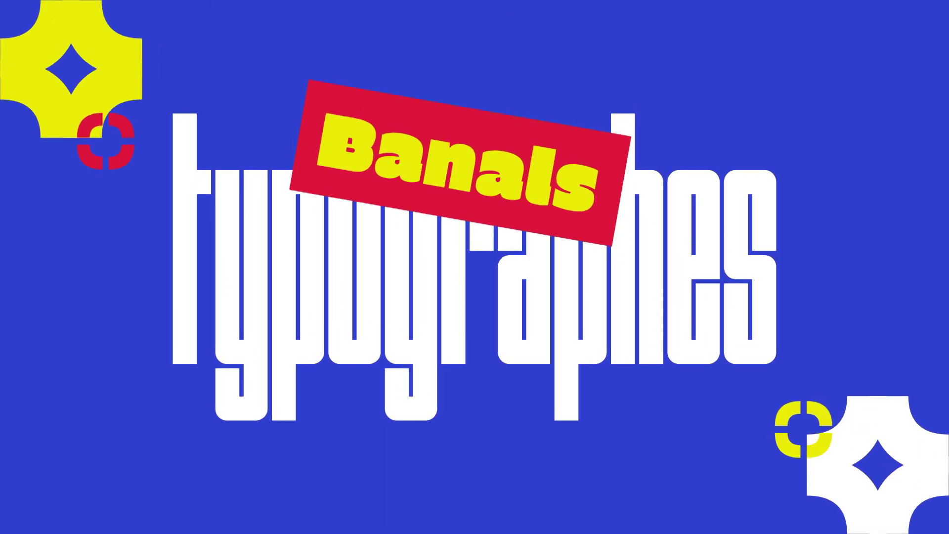
And finally, the new episode of Attention Ça Glyphe !
Thank you! :)